Two Systems, One Platform: Designing a Public Ministry Tool for 7 User Profiles
This project was developed under a Non-Disclosure Agreement (NDA). To protect intellectual property and client data, all sensitive information, brand names, and visual identities have been altered or anonymized. The structure and UX logic remain faithful to the original project.
Challenge
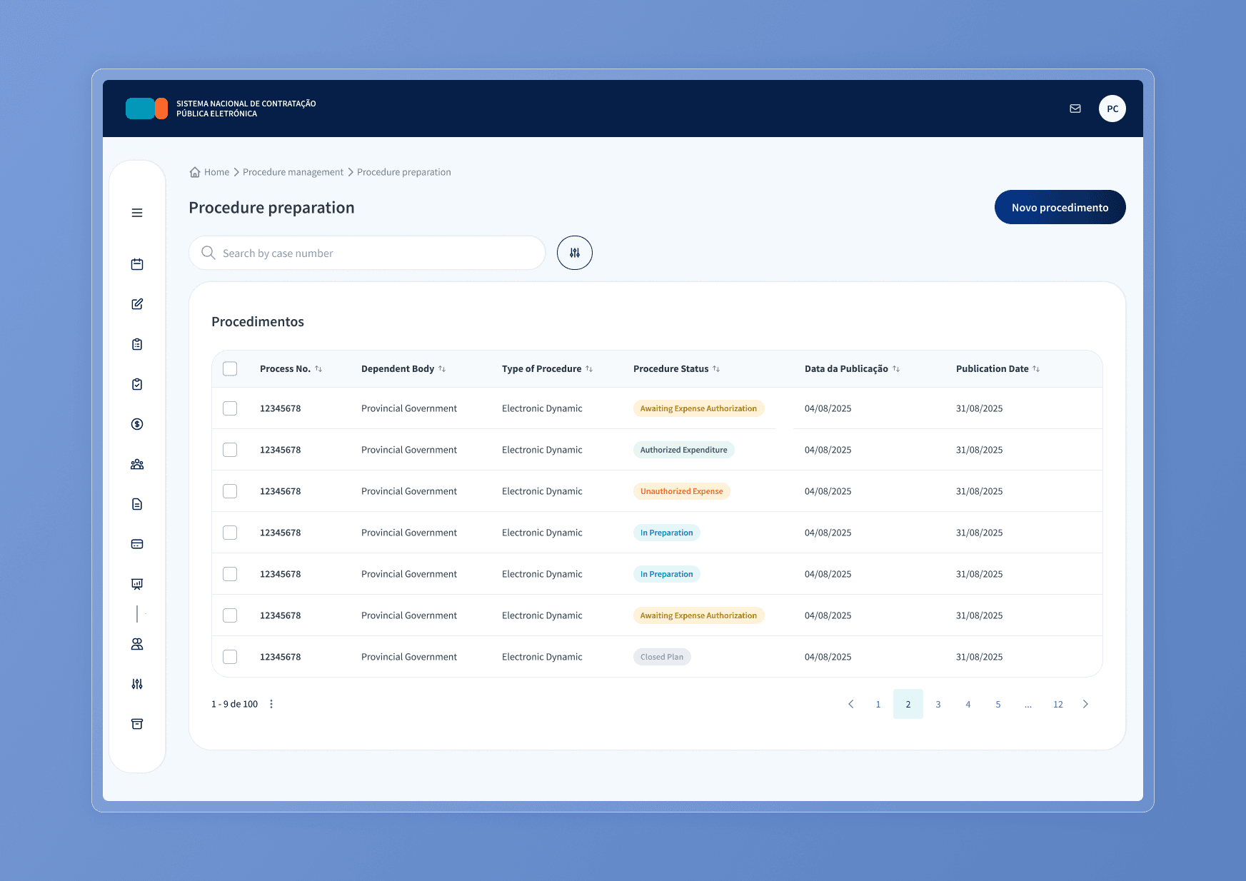
Two separate government platforms used by the Public Ministry needed to be merged into one. Both were already in production, with different interfaces, different logic, and users who had built habits around each. The new unified system had to accommodate 7 distinct access profiles, each with specific permission boundaries, without adding complexity for anyone on the other side of the screen.
- Fragmented information architecture: Merging two systems meant reconciling two different navigation models. Flows that worked independently did not translate cleanly into a single product.
- Government software with a usability problem: The existing interfaces prioritized data density over clarity. Public servants spent time navigating instead of working.
- Visual consistency at scale: With 7 profiles and many different workflows, keeping the interface coherent required a structured system from the start, not a case-by-case approach.
Process
I was responsible for end-to-end design, from information architecture to high-fidelity prototyping.
- Discovery workshops: Facilitated sessions with stakeholders from the Public Ministry and government teams using FigJam to map requirements, align terminology, and surface edge cases before any design decisions were made.
- Sprint-based execution: Work was organized in sprints tracked via Jira, with regular technical alignment to keep design and development moving together.
- Visual strategy shift: The initial direction was conservative, reflecting the typical register of government software. After stakeholder feedback requesting something more modern, I adapted the visual approach using the Brazilian Government Design System as a base and introducing more white space, larger type, and softer radius values. The result feels current without breaking accessibility or institutional conventions.
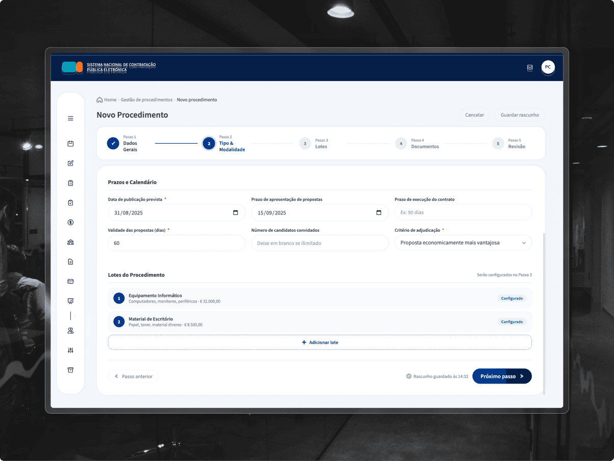
- Complex-first flow design: I mapped and simplified the most edge-case-heavy flows first, using those as templates for the rest of the platform. This reduced design time and kept the system internally consistent.
Solution
A Tailwind CSS-aligned UI Kit and a set of modular, reusable templates covering 7 critical workflows.
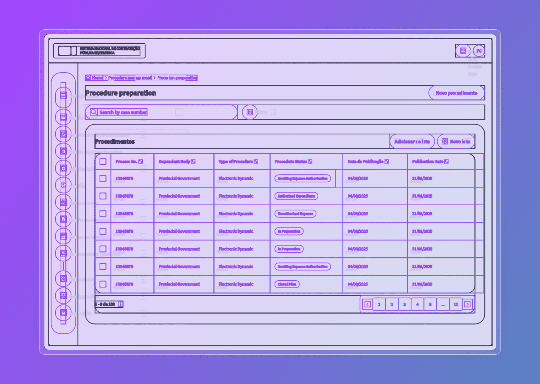
- UI Kit built for development handoff: Components were structured to mirror Tailwind conventions, so the bridge between Figma and code was minimal and the risk of visual drift during implementation was low.
- 7 flows designed for the hardest cases first: Each flow was built to handle the most complex permission and state combinations, then simplified for lighter profiles. One system, consistent behavior across all seven.
- Accessibility and contrast throughout: Rigorous contrast standards were applied across the platform. Government users include people with varying digital literacy and visual conditions: accessibility was a baseline, not an afterthought.
Results
Full platform designed and handed off to development within 6 months.
- Two systems merged into one: All user profiles, flows, and permission levels consolidated into a single coherent platform.
- Faster development through Tailwind alignment: Token-level consistency between design and code reduced back-and-forth and minimized implementation debt.
- Shorter learning curve for public servants: Unified flows and a cleaner interface reduced the cognitive load of navigating a system built for 7 different roles.