Redesigning Retention: The UX Behind a 10M-User Benefits Platform
This project was developed under a Non-Disclosure Agreement (NDA). To protect intellectual property and client data, all sensitive information, brand names, and visual identities have been altered or anonymized. The structure and UX logic remain faithful to the original project.
Challenge
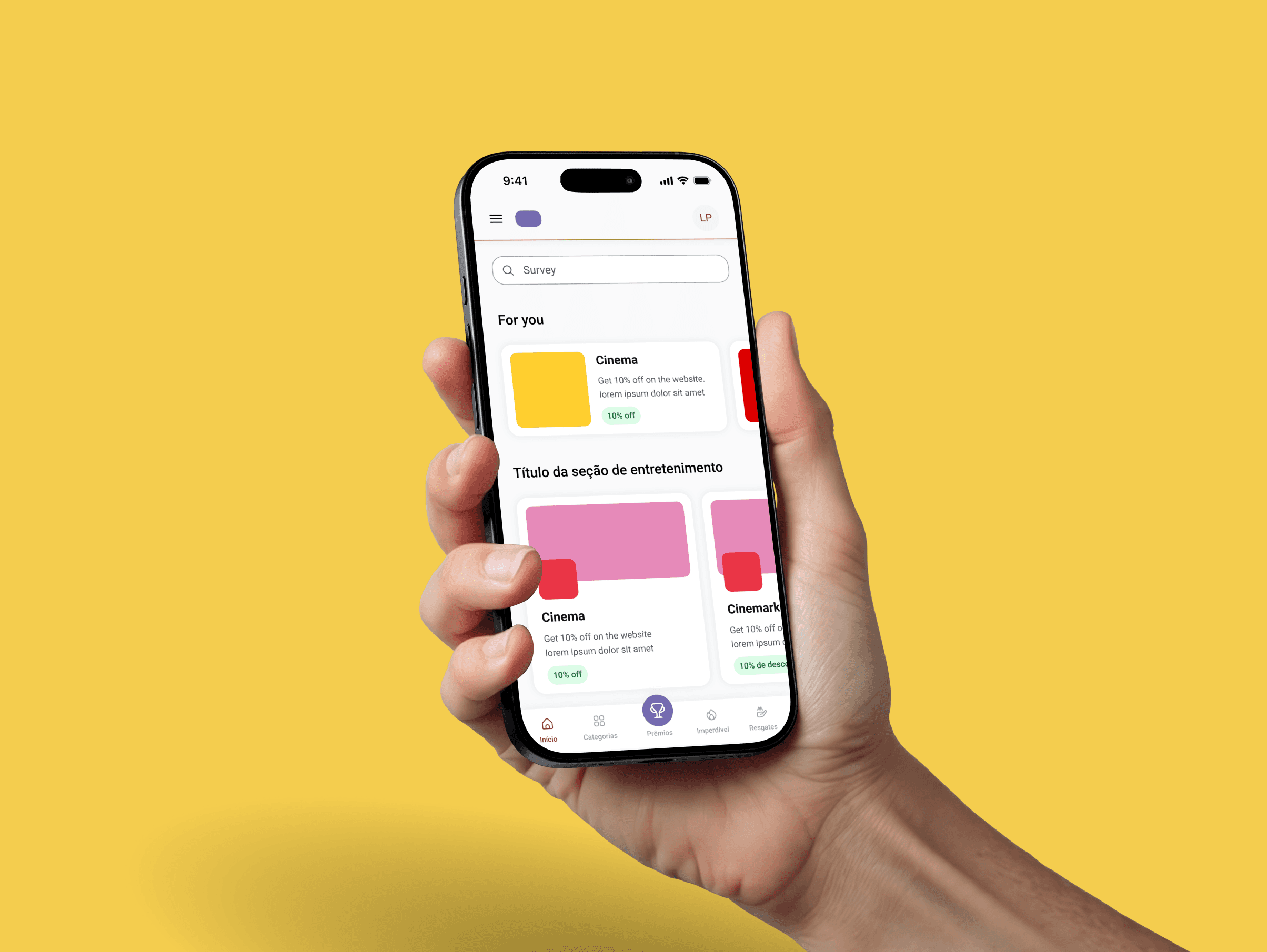
A white-label benefits club platform with 10 million users and 40,000+ partner stores across Brazil. B2B clients (enterprises, health plans, unions, subscription services) deploy it under their own brand. One client reported the club accounts for 40% of their customer retention.
- Product vs. service confusion: Clients expected a fully bespoke product. What they were buying was a configurable platform with their brand applied on top. That gap created friction in sales and onboarding.
- No mobile-first design: Most end users access benefits on mobile. The lack of mobile-first design hurt retention directly: people stopped using the platform because the experience did not work on the device they had in hand.
- Inconsistent UI across templates: Interfaces varied between templates and visual bugs appeared in client-facing environments. For companies presenting this as their own product to customers, every bug was a trust problem.
Process
As Supporting Product Designer, my focus was systematizing the component architecture and tokenization strategy so the platform could serve multiple B2B clients without duplicating design work.
- 30+ pain points mapped: Using Double Diamond methodology, the team documented and prioritized issues across the full product surface, from onboarding to the end-user mobile experience.
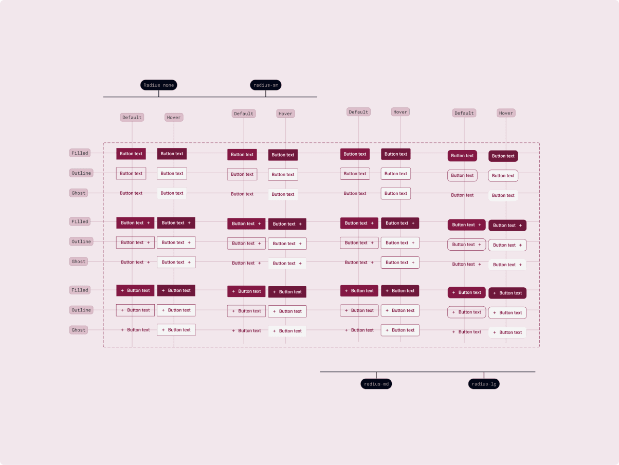
- Fixed vs. customizable elements: We defined which elements stay the same across all white-label instances (layout, navigation, spacing, accessibility) and which clients can change (brand colors, typography, imagery). This boundary is what makes the model scale.
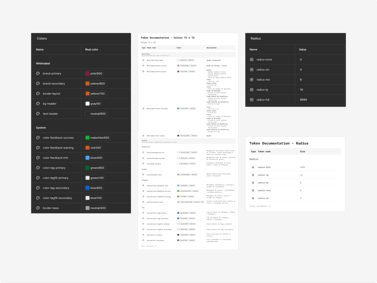
- Tailwind CSS alignment: I structured the Figma component library to mirror the Tailwind CSS framework used in development. Token naming and component variants were designed to translate directly to code.
- Mobile-first rebuild: Every template was rebuilt starting from mobile, with WCAG accessibility standards applied throughout.
Results
- 2 legacy templates rebuilt, 1 premium template created: The new templates are now the standard across all client deployments, including L'Oréal Paris, Folha de Londrina, and Unimed Paraná.
- UI Kit reduced visual bugs systematically: A shared component library replaced ad hoc fixes. Inconsistencies stopped recurring because the system made them structurally harder to introduce.
- Brand updates in minutes: Tailwind-aligned tokens mean a full brand color or typography change can be deployed with a single update, instead of manually editing multiple files.
- 10M users, R$2M+ saved in cinema alone per year: The platform's scale makes design decisions have direct business impact. Cinema is one of dozens of benefit categories running on the infrastructure this work supports.